R U OK?
R U OK? is more than just a question; it's a beacon of hope for many. As a not-for-profit mental health charity, its mission resonates deeply in today's world where loneliness and despair often lurk behind closed doors. 'R U OK?' extends a hand, urging us to stay connected and engage in meaningful conversations that can be the light in someone's darkest hour. It's this profound impact and the potential for even greater reach that drew me to explore its digital presence, reimagining how we can drive this message further and touch more lives.
The existing website appeared overwhelmed with extensive information, which was presented in a manner that lacked engagement for the users. The primary challenge was to transform this interface into a more intuitive and engaging experience for its audience.
The Challenge
PROBLEM STATEMENT
Visual Design: Many users described it as off-putting, diminishing the otherwise positive experience.
Consistency: Disparate design elements led to an unpredictable user experience.
Legibility: In places where clarity is paramount, users found the text hard to decipher.
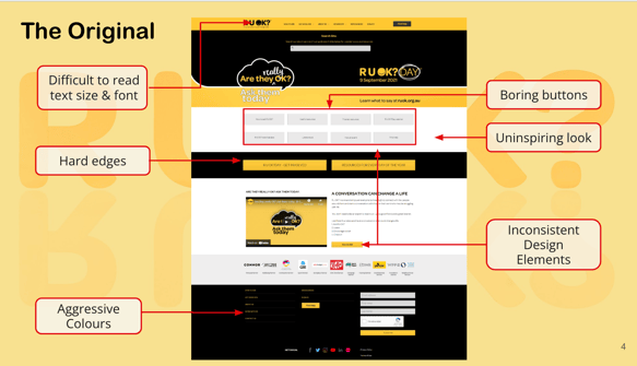

Visitors come to the R U OK? website seeking guidance on fostering a positive mental health environment and reaching out to loved ones. However, while they appreciate the content's intent and importance, they're often disheartened by a lack of visual appeal, inconsistent design elements, and potential legibility issues. Feedback consistently highlighted a few areas of concern:
Solution
In reimagining the website, the focus is on creating a welcoming and cohesive digital space, one that matches the warmth and importance of its message. Key enhancements include:


Calmer Colour Palette: Introducing a subdued and harmonious colour scheme to evoke feelings of safety and trust.
Streamlined Design Elements: A consistent design approach across all pages to ensure predictability and foster user confidence.
Improved Typography: Prioritising readability and accessibility, ensuring that every visitor can easily navigate and understand the content.
Friendly Imagery: Incorporating images that radiate hope, community, and connection, strengthening the bond between the website and its visitors.
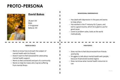
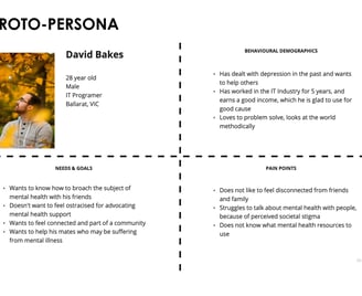
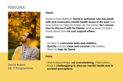
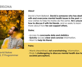
This slide compares our Proto-Persona, which is based on initial assumptions and secondary research, with our detailed Persona, derived from extensive user research. The Proto-Persona helps us quickly align on a hypothesized user profile in the early design stages, while the Persona provides validated insights into user motivations, needs, and behaviors, ensuring our design decisions are deeply rooted in actual user data.
PROTO-PERSONA & PERSONA
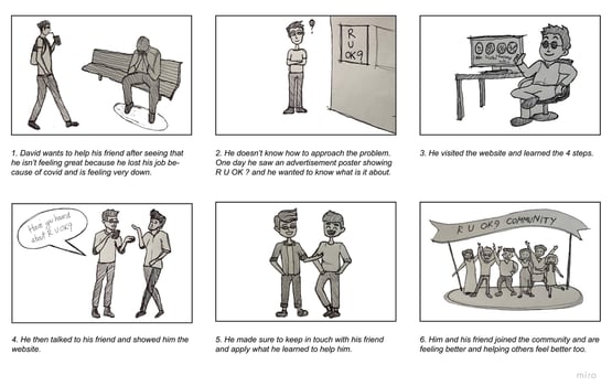
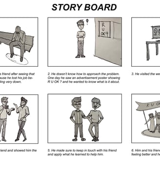
On this slide, we showcase a storyboard that depicts the user experience on the R U OK? website. The storyboard illustrates potential users seeking information on how to support friends and family’s mental health. It highlights user challenges like navigation difficulties and inconsistent design elements that may hinder their ability to access vital resources. This visualisation aids in identifying key improvements that could make the website more supportive, informative, and engaging, thereby enhancing users' ability to contribute positively to mental health discussions in their communities.
STORYBOARD
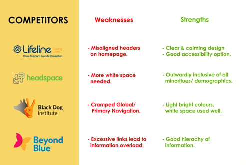
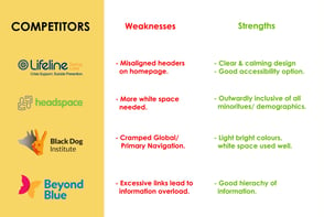
This slide presents an analysis of competitors in the mental health support space, contrasting their UX/UI strengths and weaknesses. Lifeline's clear design and accessibility options are strengths, while alignment issues are a weakness. Headspace is praised for inclusivity but needs more white space. Black Dog Institute's vibrant color usage is a plus, but its navigation feels cramped. Beyond Blue has a well-structured information hierarchy despite an overwhelming number of links. This comparison helps identify opportunities for improvement in our own website's design.
COMPETITORS ANALYSIS
LOW - FIDELITY
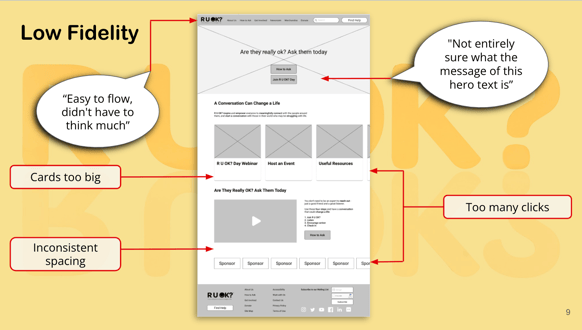
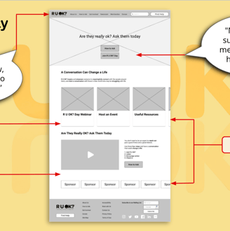
The slide depicts a low-fidelity wireframe for the R U OK? website, alongside user feedback bubbles that point out areas for improvement. The feedback suggests the flow is easy to understand, but the hero text's message isn't clear. It also notes the cards are too big, there’s inconsistent spacing, and the navigation requires too many clicks. This analysis pinpoints specific design elements that could be optimized to enhance the user experience.
ITERATIONS
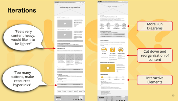
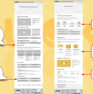
This slide showcases the iterative design process for the R U OK? website, comparing earlier and later versions of a web page. User feedback indicates the initial design felt too content-heavy and had an overabundance of buttons, suggesting a need for a lighter content approach and streamlined navigation. Subsequent iterations display a more engaging design with fun diagrams, a reduced and reorganized content structure, and interactive elements, all aiming to improve the user's journey and facilitate easier access to resources.
MOOD & IMAGERY
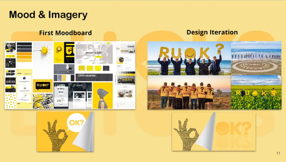
This slide effectively juxtaposes the initial mood board and subsequent design iterations for the R U OK? campaign. The mood board sets the visual tone with a bright and light-hearted color palette, while the design iteration showcases the application of this aesthetic in real-world contexts, aiming to convey a sense of optimism and community engagement. This visual strategy is central to creating a supportive and uplifting user experience on the website.
STYLE GUIDE
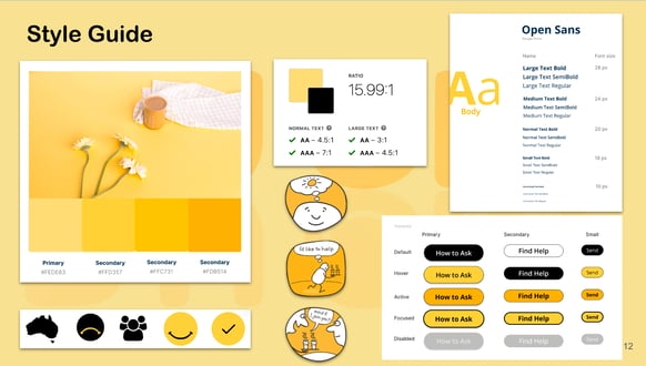
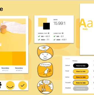
This slide is a visual representation of the style guide for the R U OK? campaign, displaying the color palette, typography, iconography, and button states to ensure brand consistency across the platform. It details the specific hex codes for brand colors, the contrast ratios for text legibility, and examples of graphic elements that align with the brand's voice. The right panel shows the type hierarchy using Open Sans font, which is vital for creating a visually accessible and aesthetically pleasing interface.
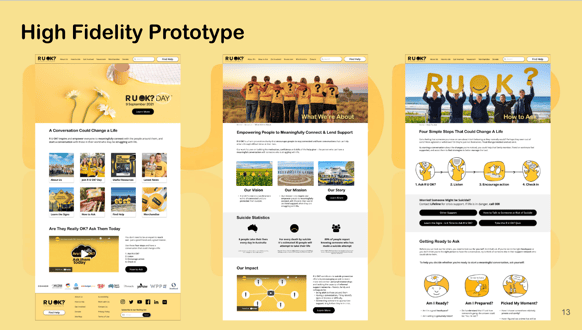
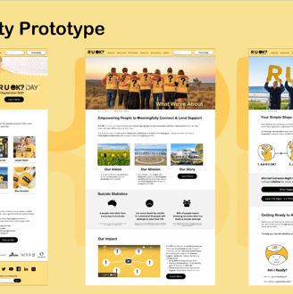
HIGH FIDELITY PROTOTYPE
