Vinnies shop for the greater good
BACKGROUND
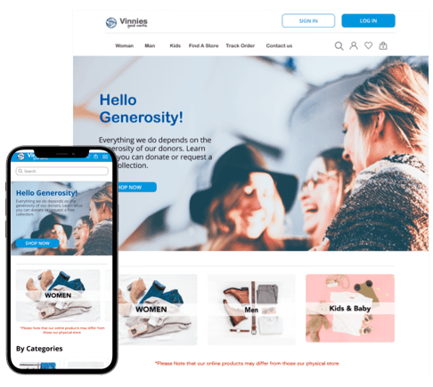
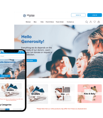
The COVID-19 pandemic has catalyzed a consumer shift towards online retail, presenting challenges for traditional stores like Vinnies Shop. As part of the charitable organization St. Vincent de Paul, Vinnies has historically relied on brick-and-mortar operations, and is now compelled to adapt to the rising tide of e-commerce to continue its mission effectively.
OUR RESEARCH
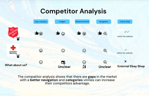
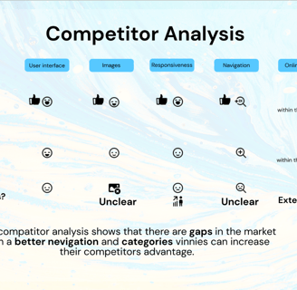
Our competitor analysis highlights a crucial opportunity for Vinnie's to refine their online navigation and categorisation, areas where competitors show variance in effectiveness. While our rivals have integrated online shops within their platforms, this is a strategic feature Vinnie's should consider implementing to bolster our market presence and enhance the user shopping experience.
“The Society aspires to be recognised as a caring Catholic charity offering ‘a hand up’ to people in need. We do this by respecting their dignity, sharing our hope, and encouraging them to take control of their own destiny.”
OUR PROBLEM
In addressing the challenge Vinnies faces, our goal is to enhance their digital storefront to not only retain but also expand their customer base and donor community amidst a market transformed by the pandemic. How can we redesign Vinnies' online experience to both resonate with the current e-commerce trends and amplify the organization's unique mission and values?
HYPOTHESIS
By reimagining the Vinnie's online shopping experience with more intuitive navigation and well-structured product categories, coupled with visually appealing design elements, we hypothesise that this could significantly boost engagement with both new and existing supporters. This strategic overhaul aims to not only enhance Vinnie's market position but also foster a deeper connection with the community, encouraging increased participation from donors and shoppers alike.
RESEARCH
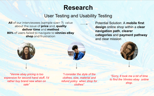
This slide illustrates the user testing and research phase, highlighting key feedback from interviewees. Users have expressed concerns about the pricing, quality, and delivery methods on Vinnies eBay shop, and many struggle with navigation, leading to frustration. The slide suggests that adopting a mobile-first design approach, streamlining the navigation path, categorizing products more clearly, and creating a more transparent payment process are potential solutions to improve the user experience and enhance Vinnies' online presence.
USER PERSONA
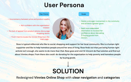
Our research findings coalesce in the creation of Rose, our user persona, epitomising our target demographic—socially responsible shoppers. The insights gleaned have been instrumental in refining the final solution. As we proceed, imagine stepping into Rose's world; Eddy will soon navigate you through our UI design process, keeping Rose's perspectives and needs at the forefront.
WeBSITE & MOBILE APP
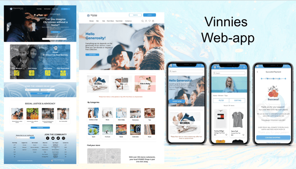
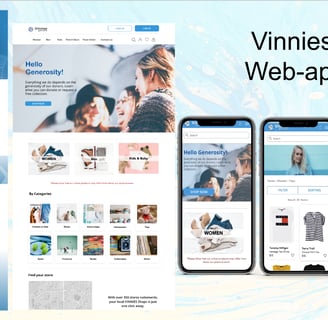
Step into the shoes of our user, Rose, as we guide you through the newly refined journey of the Vinnies web application. This experience showcases a seamless, user-friendly navigation that mirrors the thoughtful consideration we’ve woven into every page, ensuring every visitor can effortlessly engage with Vinnie's mission, whether on desktop or mobile.
USER FLOW
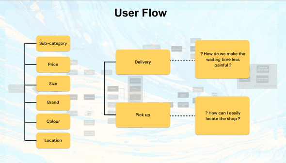
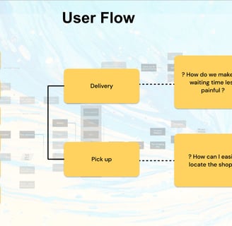
Our User Flow enhancements concentrated on refining the shopping page filters, enabling users to effectively streamline their search based on budget, size, colour, and other preferences. To accommodate varying consumer needs, we've introduced a flexible 'Pick Up' option, alongside traditional delivery, to offer a more personalised and convenient shopping experience.
WIRE FRAMING
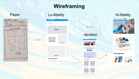
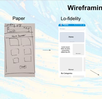
The wire framing stage focused on a mobile-first approach for the landing page, driven by our research insights. We concentrated on refining the filter functionality to streamline the product selection process for users. Additionally, we integrated a card scanning feature for quick payments and offered flexible delivery or in-store pickup options. These iterations led to the polished screenshots you see, designed to optimize the user journey from browsing to purchase.
STYLE GUIDE & TECH
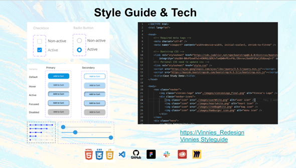
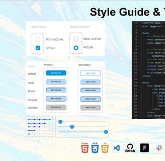
The landing page of the Vinnies redesign was our primary design focus, targeting an intuitive user experience. Concurrently, we've crafted a comprehensive style guide, meticulously coding UI components like checkboxes, radio buttons, and button states to establish visual harmony. This guide is pivotal for future development, ensuring consistency across Vinnies' digital presence.
HIGH-FIDELITY PROTOTYPE
This final part of the high-fidelity prototype showcases the detailed design progression for the Vinnies online platform. The sequence from paper sketches to digital wireframes, and ultimately to polished interface screens, encapsulates the meticulous crafting of the user experience. These refined interfaces are ready for user testing and further iterations, which will bring us closer to a user-centered, functional, and aesthetically pleasing final product.
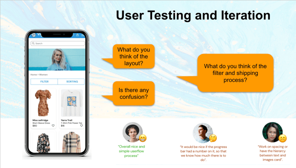
USER TESTING & ITERATION
In this user testing and iteration phase, we seek candid feedback to fine-tune the Vinnie's app. The current prototype emphasizes an accessible layout and streamlined filter and shipping functionalities. We invite users to critique the layout's intuitiveness and the efficacy of the shopping process. Feedback, such as the need for clearer progress indicators and improved text and image hierarchy, will inform the next round of revisions for an optimal user experience.
